Sequence navigation, filtering and bulk edit improvements, plus extended support for External IDs
February 9th, 2026 (Revision 1), print this pageWe have made a set of practical improvements across Sequence and On-Demand, aimed at making large worklists easier to navigate, keeping job information in sync when multiple users or systems are involved, and external identifiers more consistently available across entities and publication workflows.
Let’s get into it!
Improved navigation in Sequence
We’ve made it easier to navigate through long lists of jobs in the Sequence Work page.
What’s changed?
- Navigation controls are now available at both the top and bottom of the work page
- A new day-level filter lets you quickly narrow the list to a specific date
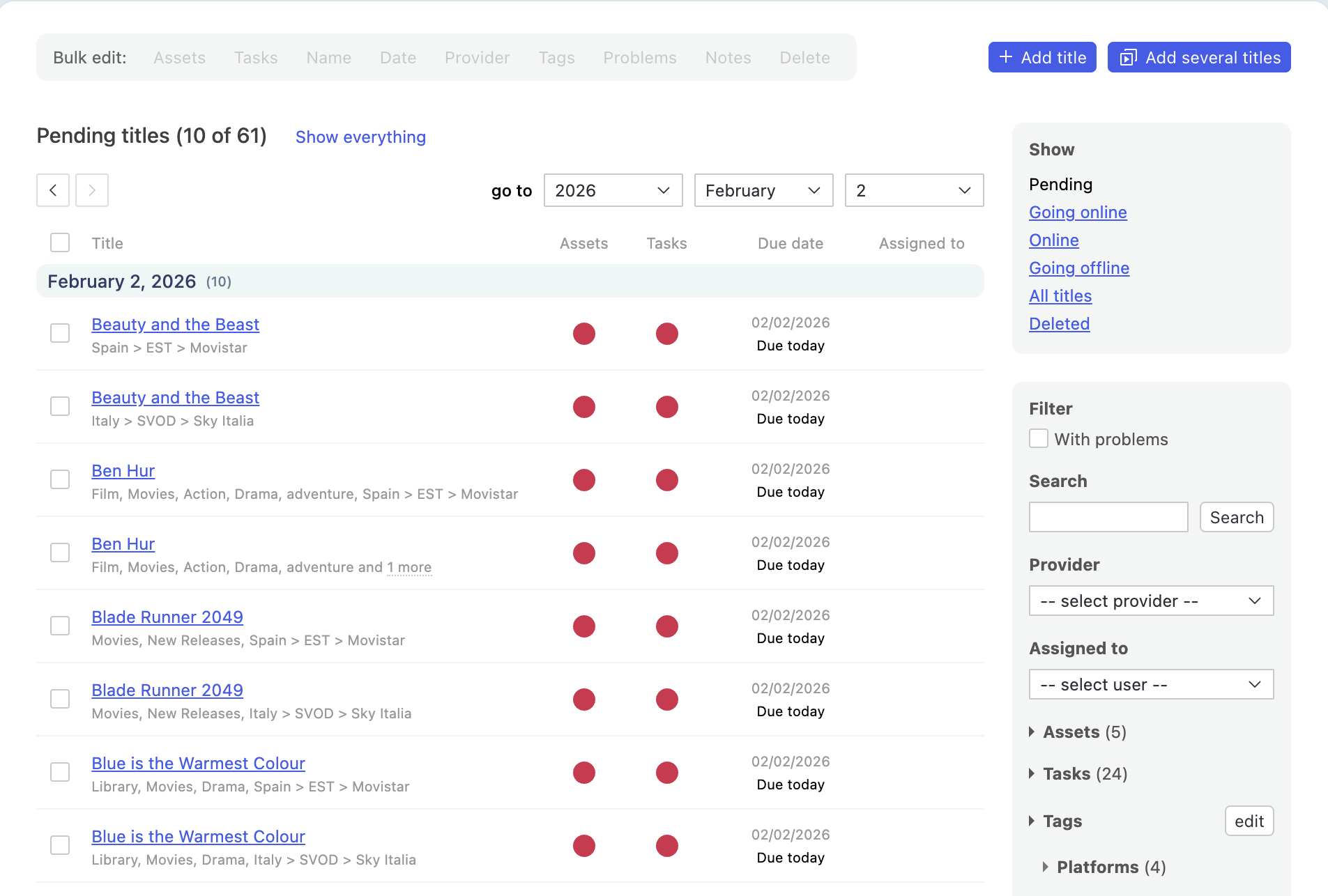
Why this matters
- Reduces scrolling when working through long lists
- Makes it faster to jump between days when planning or resolving issues (especially handy if you manage big batches of content processing!
Dynamic updates within Sequence jobs
When you’re working inside a Sequence job, you’ll now be notified if the job is updated by another user or via an integration.
This lets you continue working without interruption, and refresh the page when you’re ready - confident you’re seeing the latest state of the job.
Why this matters
- Helps teams collaborate safely on the same jobs without accidentally working on outdated information
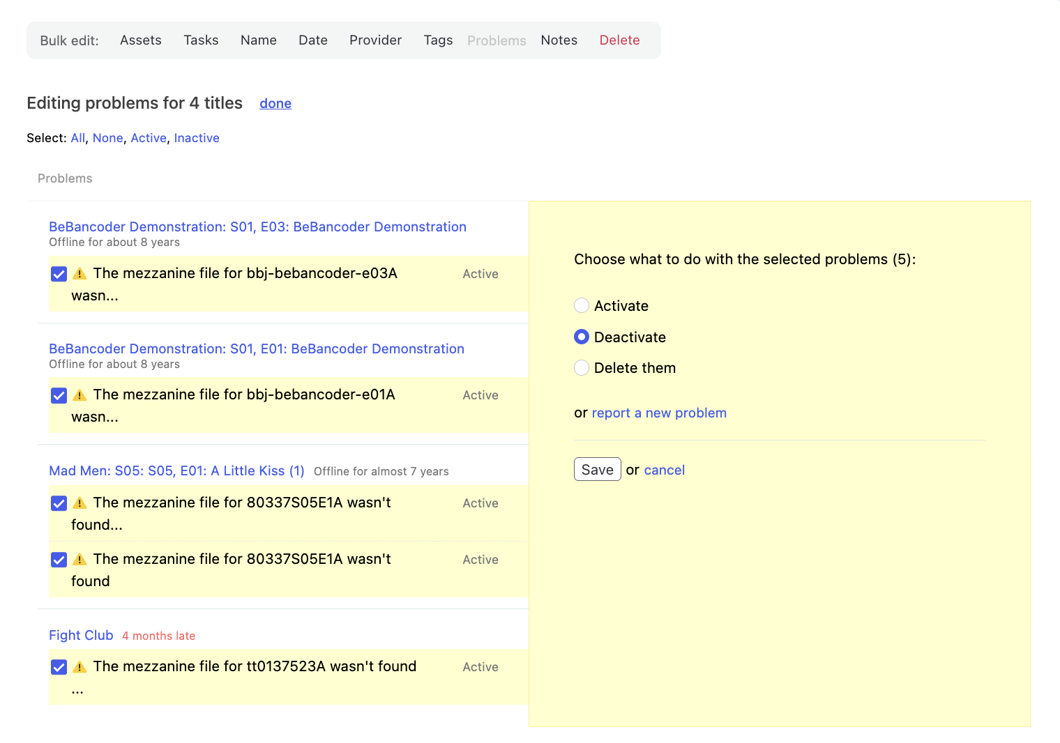
Bulk editing of problems in Sequence
Managing problems across multiple jobs in Sequence is now faster and more consistent.
What’s changed?
You can now add, activate or deactivate, and delete job problems in bulk across multiple Sequence jobs.
Why this matters
When the same issue affects many jobs, handling problems one by one slows teams down and increases the risk of inconsistency.
Bulk problem editing helps you resolve widespread issues more efficiently, and reduces repetitive manual work.
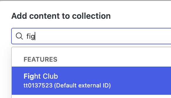
External IDs extended to more entities
You can now manage multiple External IDs for Contributors, Versions, and Images, and choose which one is displayed as the main External ID.
ℹ️ The ‘main’ External ID is the one that displays on search results and more prominently visible as you browse through the Catalogue!
External IDs are also available for Franchises. Reach out to your Customer Success team if you’d like Franchises enabled in your catalogue.

More flexible filtering with ‘OR’ logic in Sequence
Filtering in Sequence is getting more powerful and easier to use, especially for complex operational queries.
What’s changed?
- Filters support OR logic, allowing you to match any of multiple values
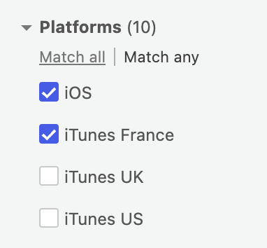
Why this matters
Operational work rarely fits into a single category. ‘OR’ logic lets you capture all relevant work in one view, instead of jumping between multiple filters or missing items.
Improved table sorting visibility
Tables now clearly indicate which column is currently sorted. You can click any column header to sort by that column and toggle between ascending and descending order, making it easier to understand and control how data is displayed.