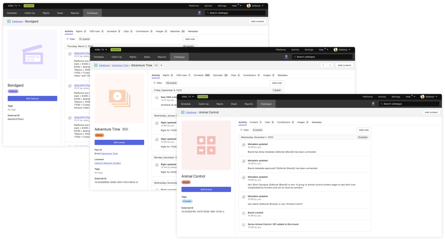
We are glad to present one of the biggest updates we have ever done in our product. As a continuation of the interface upgrade we started in the Schedule module and the Catalogue index, we have now tackled the Catalogue profile pages. This includes every section of every item in the Catalogue. Bye, bye, old interface.
General improvements
Screenshot here
Now the item profile page fits better in the browser’s width, making the most of the screen’s real state. The left sidebar containing the title details can be manually resized, giving users the power to decide how prominent they want this information to be.
For sections containing tables, the column’s width can be changed as well, allowing the creation of more efficient views.
To support this new responsive layout, we’ve changed the menu navigation. What was a vertical menu on the left side of the screen is now a horizontal menu with tabs above.
We’ve also changed the placeholders for the titles cover. Now each entity has a custom color and icon, which makes it easier to identify the type of content a title is.
Activity section
The new Activity page design displays event information more clearly and contains a small improvement on the notes feature - it’s now possible to store more than one note in a title.
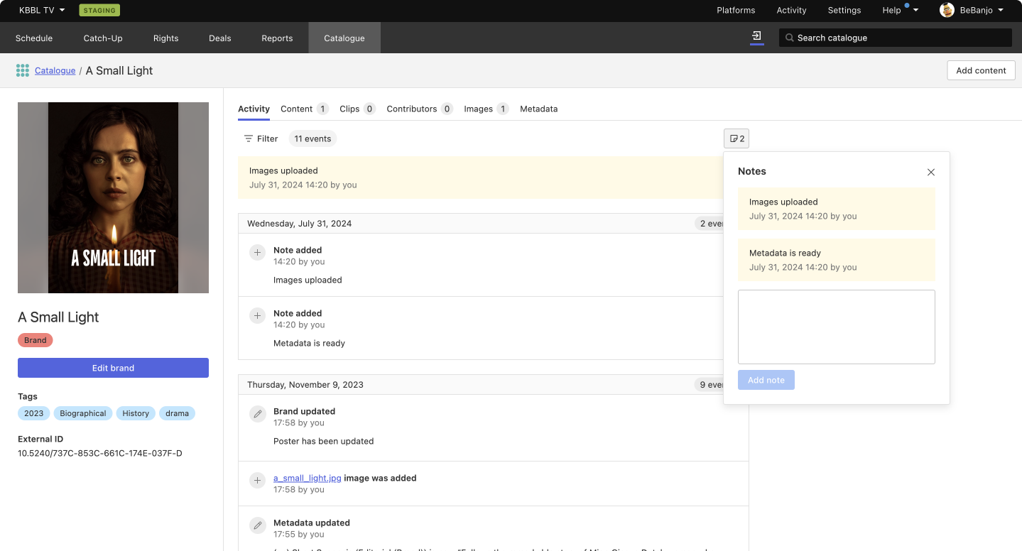
The most recent note will be shown at the top of the Activity section, and when clicking on the note icon the notes history will be displayed.
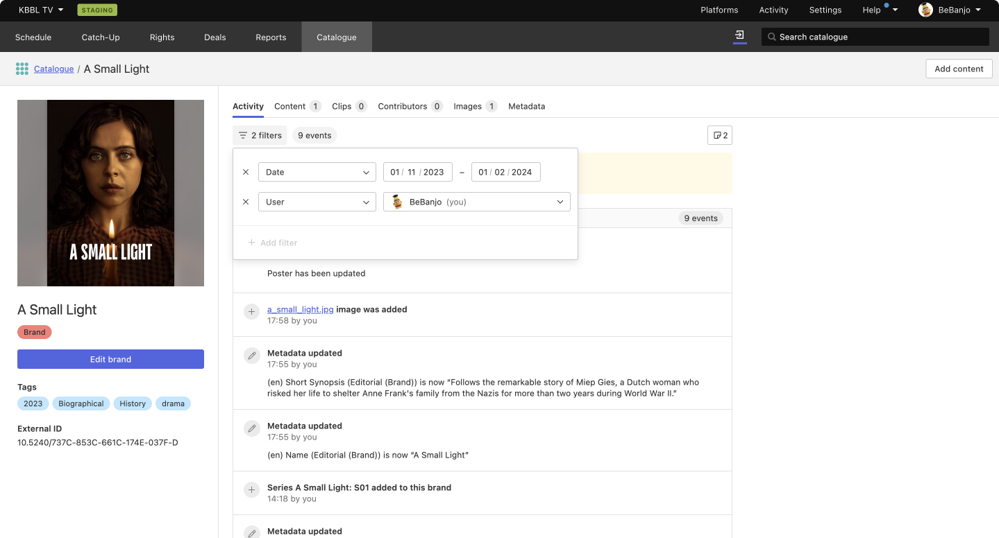
You can also filter the information displayed in this page by date and user. Further options will eventually be included to allow for more flexibility and efficiency when working with the activity events log.
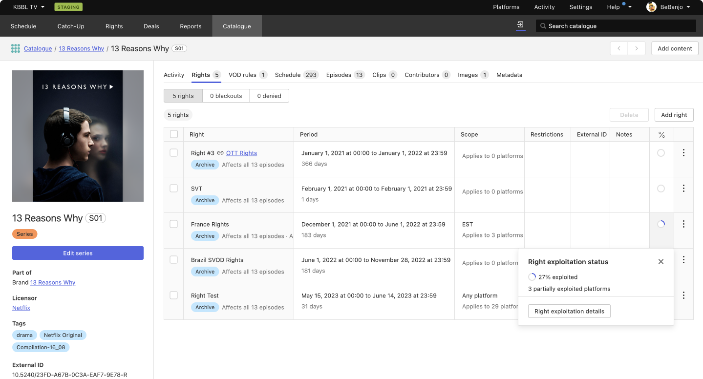
Rights section
Rights are now displayed in a table, which allows users to visualize more rights and their information at a glance.
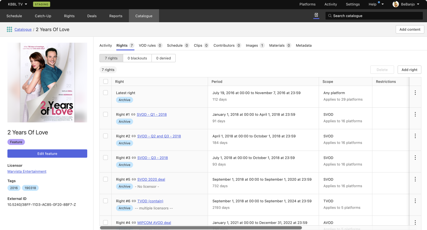
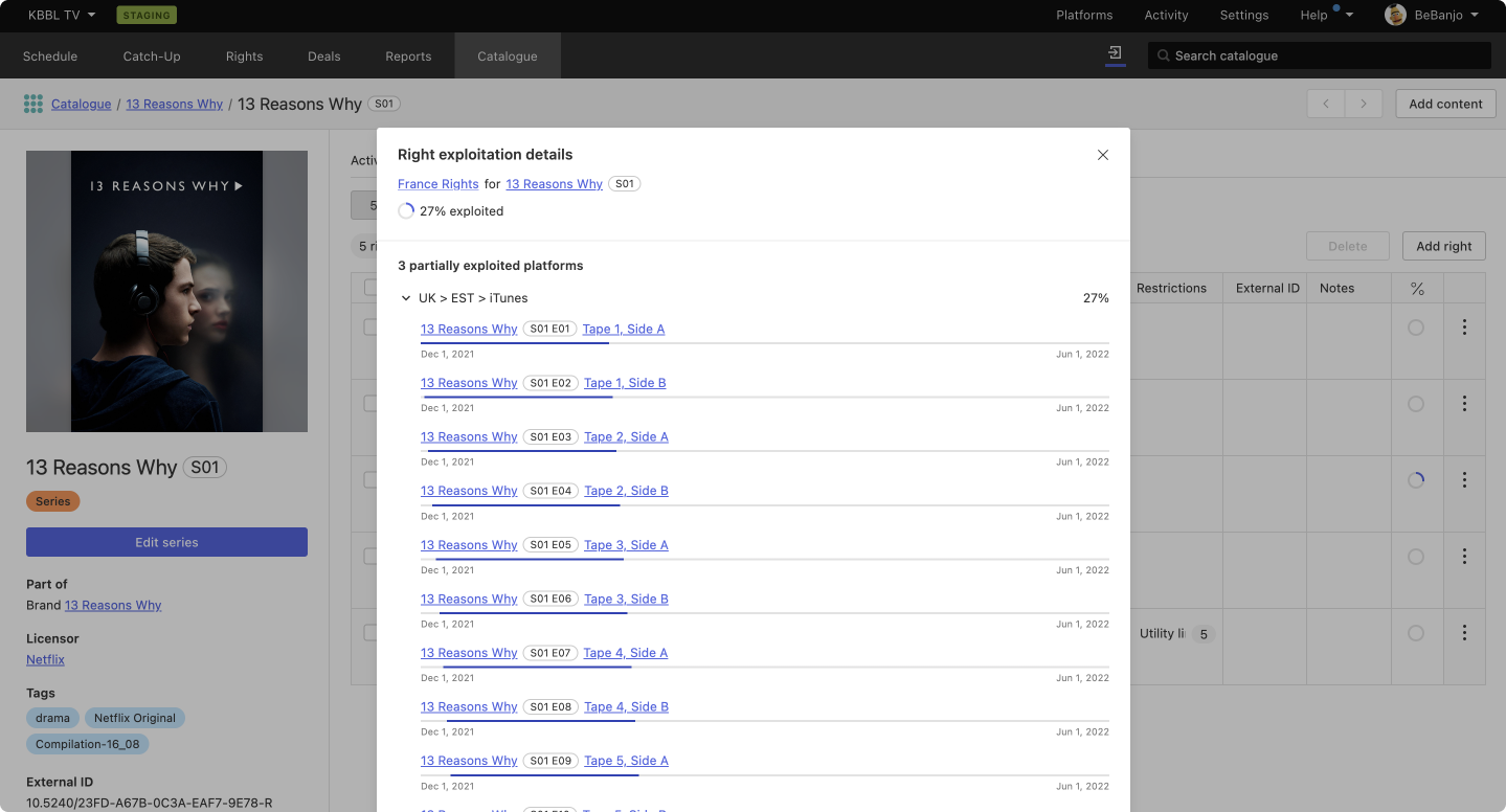
We’ve included an additional piece of data for each right - its exploitation status - so users can easily check to what extent that right is in use. It’s possible to open a detailed view to see exploited platforms and dates.
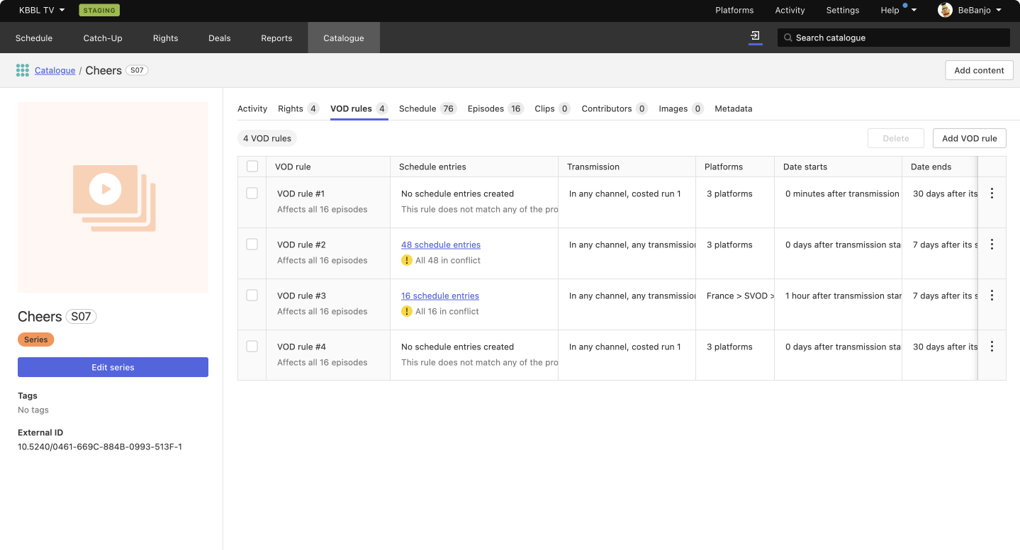
VOD rules section
We’ve improved this section in a similar way to Rights: turned the old layout, which wasn’t efficient to review large numbers of VOD rules, into a table were the information is more organized and easier to parse.
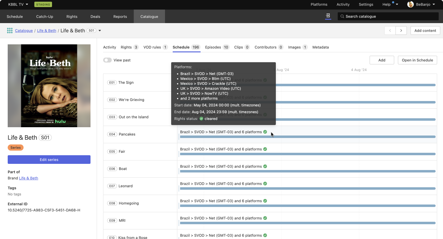
Schedule section
We’ve done a complete revamp of the timeline that displays the title’s schedule entries. Now, apart form being responsive, we’ve improved the timescale management and the representation of information.
By default, the timeline only shows the schedule entries from the present time onwards. It’s possible to view past schedule entries though, by enabling the View past option. In addition, the time scale is dynamic and it changes to show as much information as possible on screen.
When a title is scheduled in several platforms with the same start and end dates, these schedule entries are represented as single line in the timeline, with detailed information about platforms as a pop up when hovering.
Materials section
Now materials are gathered under the same section (Materials). We’ve renamed Assets to Versions so we’re more aligned with the industry norms and the actual language of users. And thanks to the responsive layout now we’re able to show the full list of properties in the table for each type of material.
Segment types
You spoke and we listened! Segment type data is now also available in the UI. This information used to only be available in the API, but we understand how useful this data is and how it can improve users efficiency when made easily available in the Catalogue.
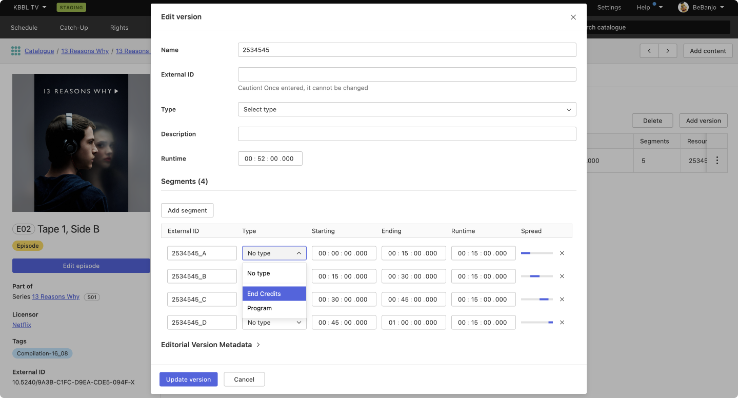
Segment types can be controlled in the Settings page: Enumerations → Segment types. Or ask your TAM friend!
Episodes section
Apart from the general improvements, we’ve introduced the ability to delete episodes in bulk from this page.
Images section
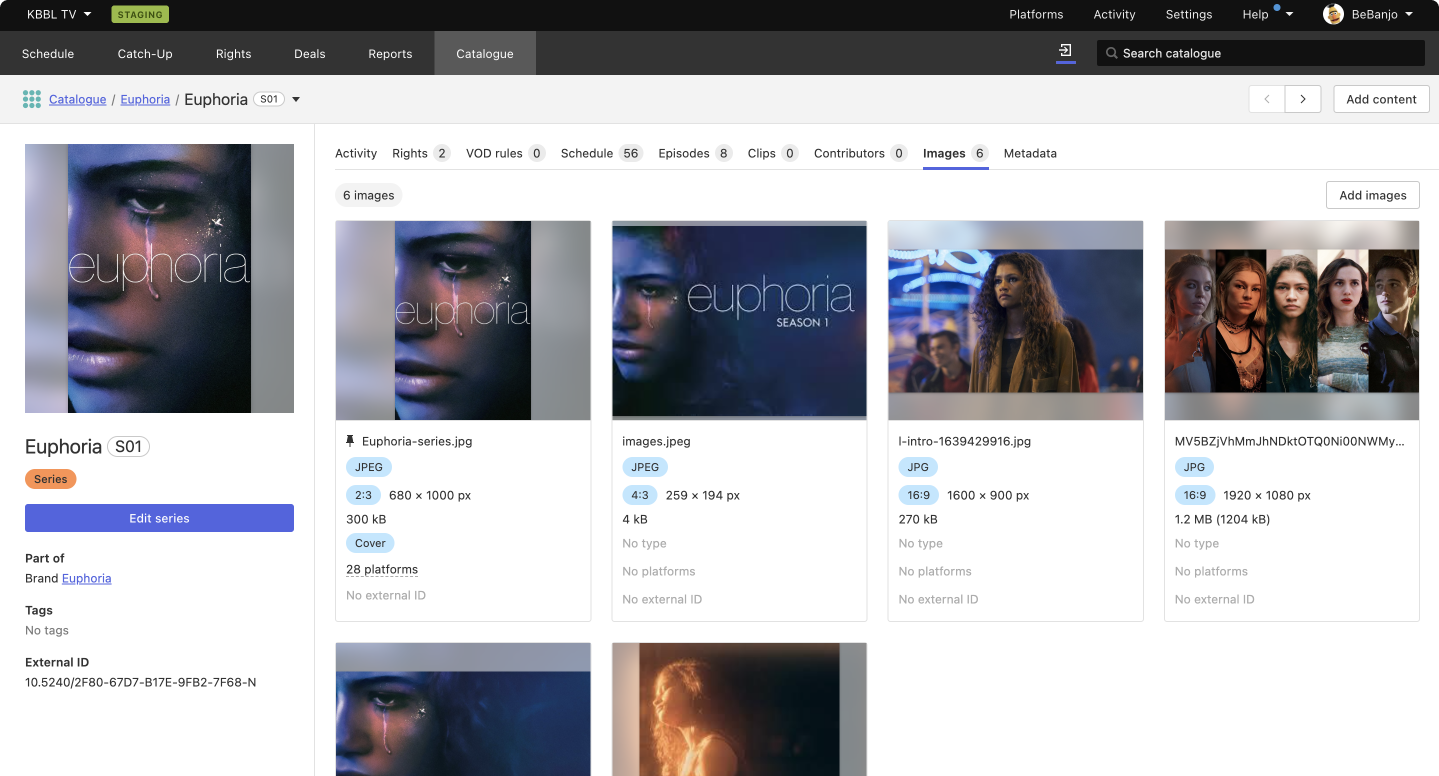
Detailed information about images used to be hidden and only visible when clicking on each image. This could be a tiring process when having to review information for many images. To solve this problem, we redesigned the images grid to display all image data at a first glance, saving you a lot of clicks!