The Catalogue is the heart of Mediagenix On-Demand; it contains all of the collections, series, episodes, and features that you schedule and publish on your (or third party) platforms. This change introduces a new look and feel for the various Catalogue pages as a result of us building and implementing a new “framework” that enables new features to be developed more quickly for you in the future (such as Image management and full support for Renditions, Audio Tracks, and Subtitles). We’ve taken the opportunity to squash a few bugs, improve responsiveness and performance (including the Import Titles feature), add some small (but useful!) features, and introduce a visual and functional consistency across the Catalogue. This change should not affect your daily workflow in significant ways, but we hope it will make the Catalogue a pleasure for you to use. This note describes what has changed in full, and as usual you can contact support or your technical account manager for further clarification.
Catalogue
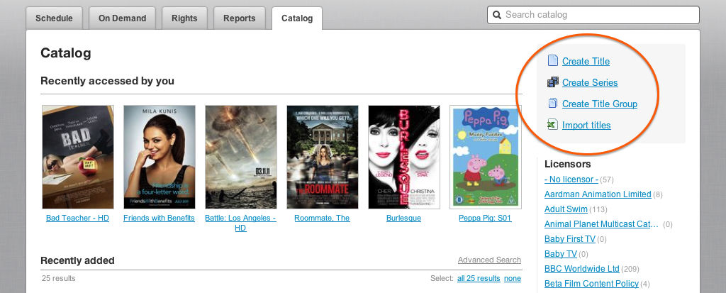
When accessing the Catalogue the first change you’ll notice is that the links for creating content have been moved to the top right; there are now separate links for creating Titles and Series.
Revised Layout
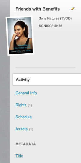
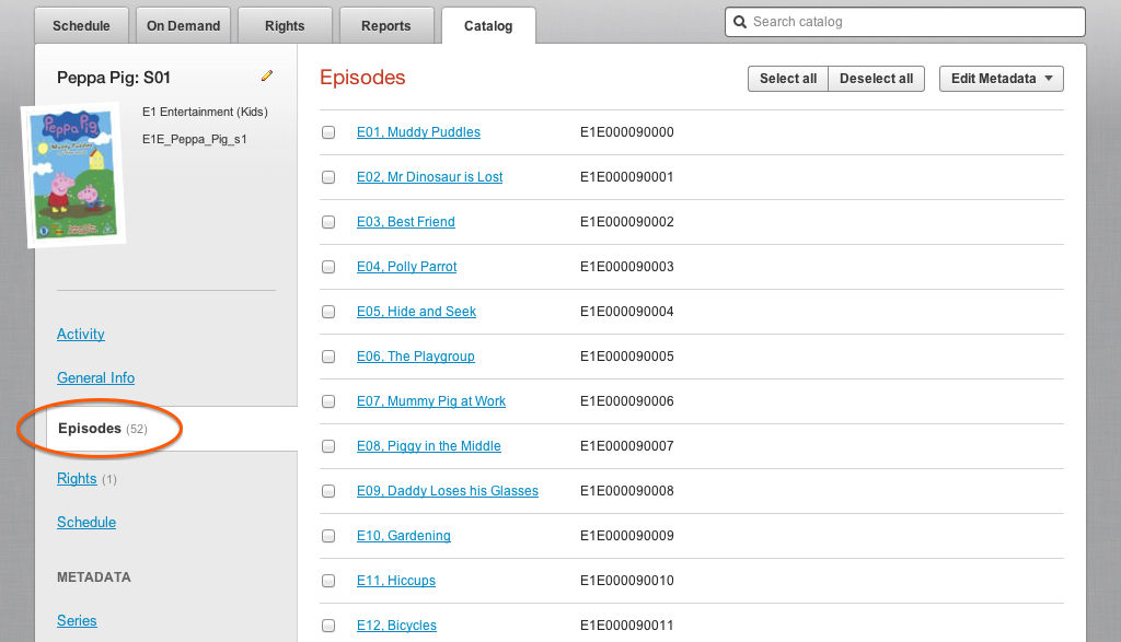
The most obvious change is the new layout of the page for an entry in the Catalogue: the horizontal arrangement of tabs for Overview, Metadata, Schedule, and Rights has been replaced by vertical sidebar on the left of the page. This new vertical layout is clearer, doesn’t require you to move between separate tabs, and makes room for new upcoming features like Image Management. The sidebar provides links to the Activity, General Info, Episodes (for Series and Title Groups), Rights (for features and Series), Rules (for catch-up), Schedule, and Assets. You can also access Metadata groups (e.g. Title, Product, Images) directly from the sidebar (saving valuable clicks!). The Episodes, Rights, Rules, and Assets links show (in brackets) how many items they contain, again this saves you a little time. Notice that the Licensor, External ID, Tags and parent Series or Title Group (if applicable) are displayed next to the poster image.
New date and time picker
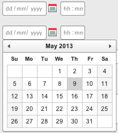
All date entry fields have been replaced by a new date picker that always includes a calendar, and a time portion (if applicable). This makes it much easier to enter relative dates, such as “take down a week on Monday”.
Editing the General Information
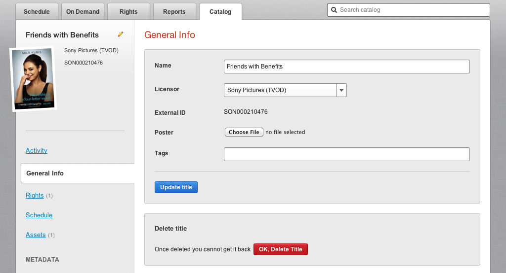
To edit the General Information for an entry in the Catalogue you can either click the pencil icon next to its name, or click on the General Info link in the sidebar. The General Info page lets you change the Name, Licensor, Poster image, and Tags; you can also set the External ID.
The option to delete content has been moved, within the General Info page, and now uses a clearly labeled and separated button; hopefully this will help prevent those “whoops-a-daisy!” moments.
Creating Title Groups
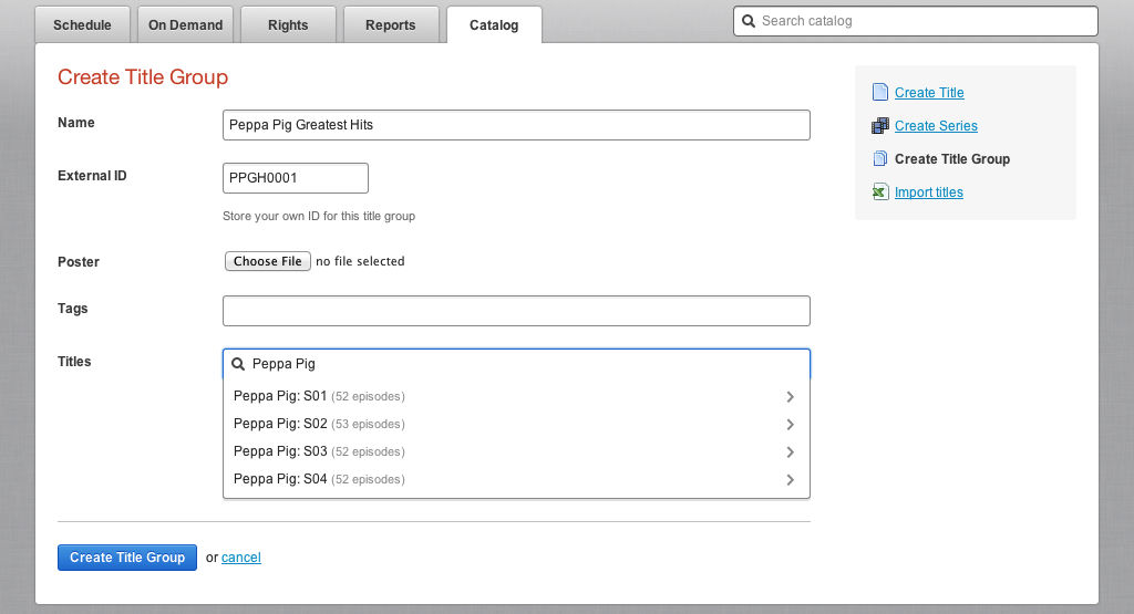
The Create Title Group (aka Collection) page now uses the same design as the Create Series page, and allows you to create a collection in a single step. If the title search returns a series then the number of episodes is shown next to the series name and you can select the series to show its episodes; you can also use the cursor keys to quickly move through the search results and episode lists.
As you add titles from the search results they are removed from that list and are shown below the search results; you can delete titles from the collection here as well. Click “Go Back” to return to the search results.
Navigating Series and Title Groups
When you display the list of content in a Series, or Title Group, the names and external IDs are shown in two columns, This makes it easier to scan the list and find the item you’re looking for.
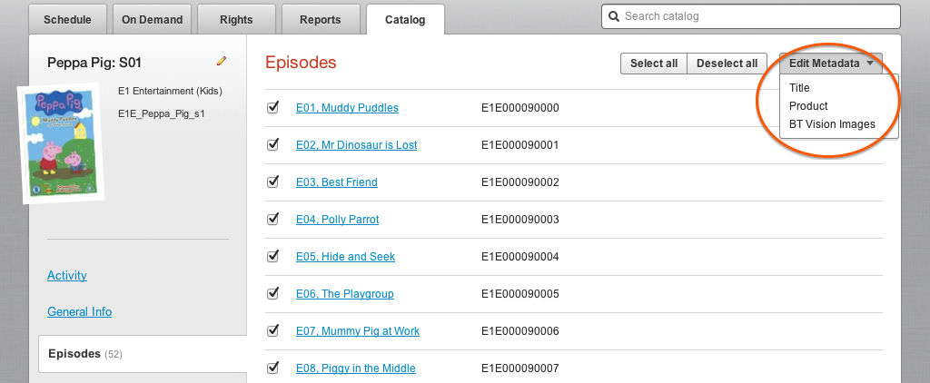
Notice how the Episodes link in the sidebar shows the total number of episodes in the series. When editing the Metadata for multiple episodes in a series you now choose which Metadata group to work with; remember that the pre-filled values in the editing page are the ones that all the selected episodes being edited have in common.
Assets
The Assets for a feature or episode are now shown in a single list from which you can choose to edit or delete an Asset.
When adding or editing as Asset, the name and value of each field are shown in two columns; this makes it easier for you to review the Asset and quickly move through it to make updates.
Rights
The layout of the Rights pages has been refined and de-cluttered; important information is highlighted in yellow.
Rules
The layout of the Rules (for VOD catch-up) pages has been refined and de-cluttered.
Metadata
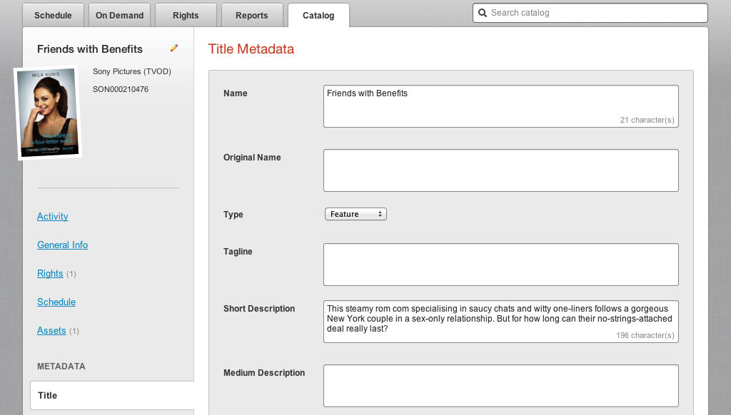
All Metadata pages now show the name and value of each field in two columns; this makes it easier for you to scan a page to review the Metadata and quickly move through it to make updates.
There are now three different sizes of text field available in Mediagenix On-Demand: short, long, and “textarea”. In the screenshot above all the text fields are “textarea” and here’s an example of the different sizes:
Import Titles
The layout of the Microsoft Excel document used by the Import Titles feature has changed slightly to make it consistent with the rest of the Mediagenix On-Demand application. The “Title” column has been renamed to “Name”, and the “Series Title” column has been renamed to “Series Name”. The instructions page and example file reflect these changes; you should update your Microsoft Excel documents to use the new column names.




Reference
movida#667New Layout for the Title and Series pages