Towards the new Mediagenix On-Demand Catalogue (Part 1)
January 15th, 2020 (Revision 4), print this pageAll of you fabulous Mediagenix On-Demand users will notice that the Catalogue is on its way to a brand new look.
Last year we spent time speaking to a number of you in detail. From those conversations, we identified a set of visual and behavioural changes in the Mediagenix On-Demand Catalogue that will improve the speed and efficiency with which you manage your content.
This is a major (and exciting) overhaul. As a result, we have chosen to split the design up into small, manageable chunks for implementation and we will periodically provide you with release notes that describe these …tasty chunks.
As always, if you would like additional clarification on any of these changes, or if you have any doubts, you can contact your Technical Account Manager.
Let’s crack on, with Part 1:
Easier to locate and flag content changes
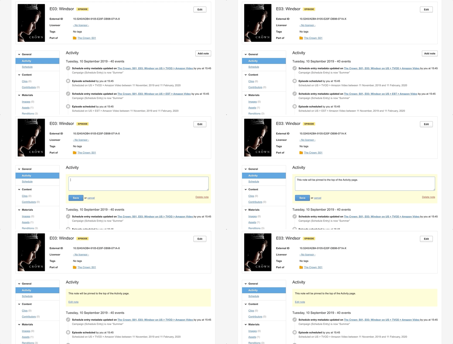
We have made two major changes to the Activity Page so that you can identify what changes have been made to your content with greater ease:
- We are not grouping similar events together anymore, so you will be able to see all the events in the Activity page at first glance. Phew!
- We have changed the behaviour of notes: Previously, notes could be created and would be displayed chronologically mixed in with the rest of the events; now, notes will always be pinned to the top of the page. Also, there will only be one note per Catalogue entry (but that note can be as long as you like and editing as often as you like).

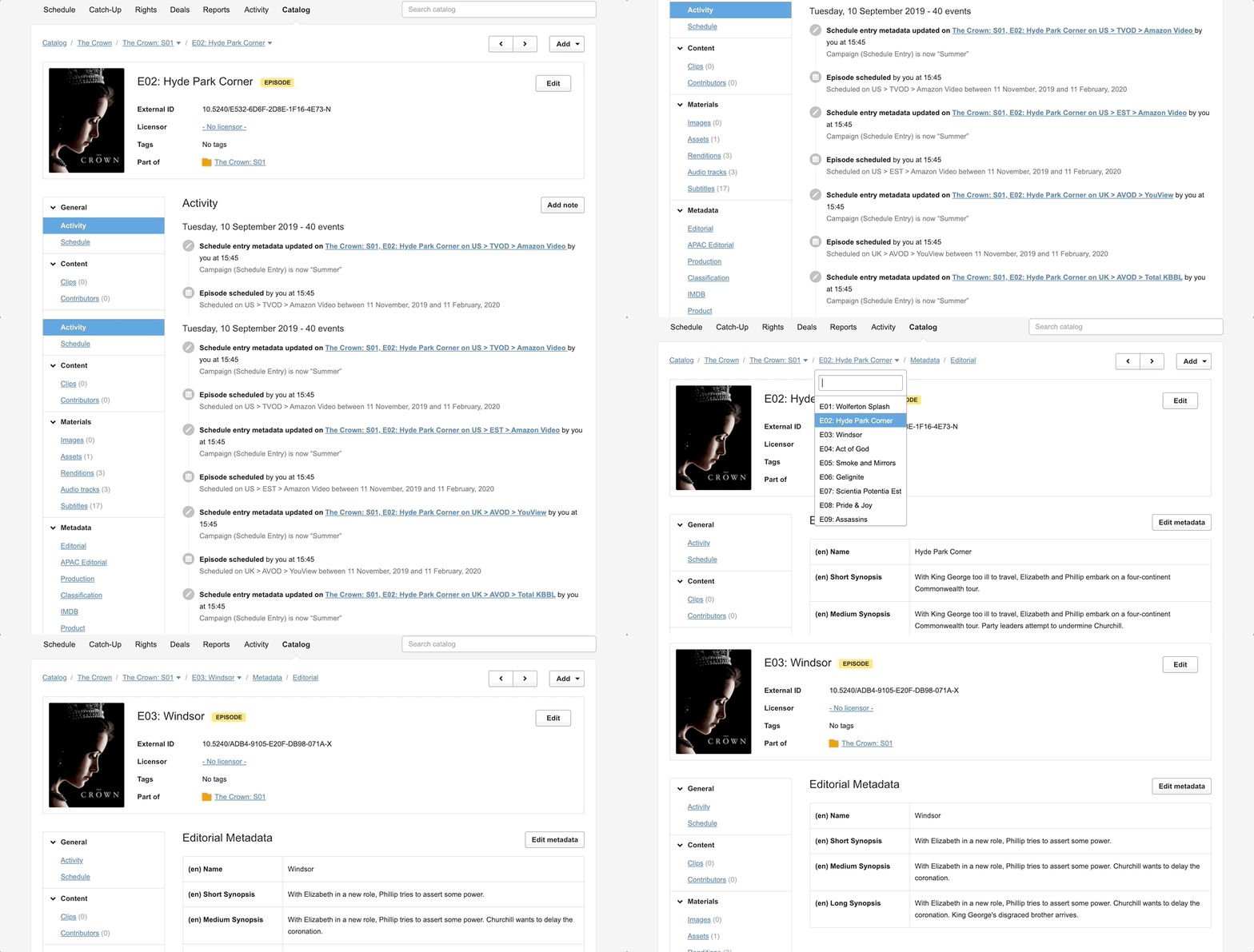
Faster to navigate between the episodes and series of a brand
You can now easily jump from one episode to another whilst staying on the same section, or search for a specific episode if the series has more than 10 of them.
You can also use the arrows to the right of the page to jump to the next or previous episode.

More simple to locate and change specific metadata
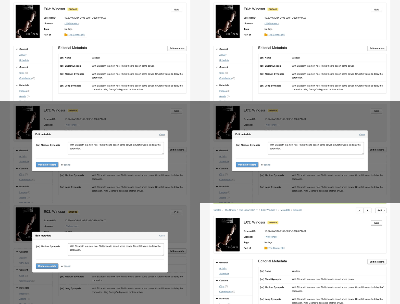
Metadata is now presented to users using a more compact structure and, whilst you can still edit all metadata fields at once, it is now also possible to edit single fields at a time:

This is particularly useful when you have Metadata Groups that contain a large number of keys, and you only want to make a quick, single change to one of those keys. You no longer need to scroll and locate the key of choice, twice.
Visual improvements
Additionally, we have added navigation tooltips, new icons, a hover effect and a bunch of other small but beneficial visual enhancements to the Catalogue.
We hope you will find them to your liking.
References
movida#9057New catalogue: redesigned activity page (I)movida#9168New catalogue: navigation (II)movida#9279New catalogue: new metadata page (III)