Just like Mies, our designers and developers believe that God is in the details and are always looking to improve those small details that lead (we hope) to a better user experience for you; this release note describes recent changes to the general appearance of Mediagenix On-Demand and the Schedule page in particular.
This note describes what has changed in full, and as usual you can contact support or your technical account manager for further clarification.
Improved layout and Schedule page
General Appearance
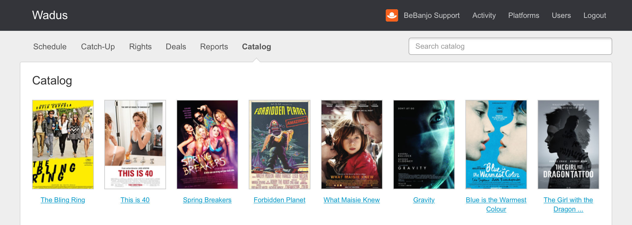
Tabs, shadows, and gradient fills are so 2007 and have been banished in favour of a simpler and flatter layout. Here’s an example for the Catalogue page:

Note that the current page (e.g. Catalogue) name is highlighted in bold, with an indicator underneath it.
This isn’t just a cosmetic change (we’re not that shallow) and we’ve made some behind the scenes changes that make it easier for us to add new features and improve existing ones.
Schedule Page
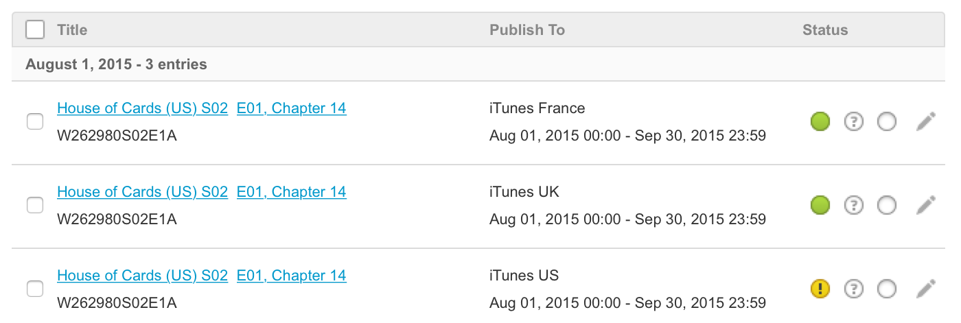
After we made changes to the Schedule page back in May we realised that the Asset Name for a Schedule Entry could be truncated (indicated by an ellipsis) if it was quite long, which was very annoying for those of you that use long Asset Names…

Well, my fellow BeBanjers, our long national nightmare is over and we’ve improved Asset and Tag truncation and made some other small changes as well:
- If an Asset has Segments we show how many in brackets after the Asset name.
- Clicking an Asset shows a popover with a summary of any Segments present, you can also edit the Asset and its Segments.
- The time portion of the Start and End date is now shown; if the Schedule Entry is for Catch-up then the tooltip tells you this (and its dates are shown in a lighter shade of grey).
- If the tag list has been truncated (indicated by an ellipsis) then the popover shows you the full list of tags.
Reference
movida#3757Optimise the room for the Asset Name in the new Schedule pagemovida#4006New main layout